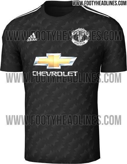
Manchester United Kits 2017/18

The actual playing kit has an ironed on badge, something to do with comfort whilst wearing.

Looks genuine that kit, plenty of room left for sleeve sponsors.


Aye so I've heard. Wouldn't be good if you had to wash it 40-50 times though. :lol:
 
manchester-united-17-18-away-kit-2.jpg


http://www.footyheadlines.com/2016/11/manchester-united-17-18-away-kit.html?utm_source=notification

Released 10th May
 
The actual playing kit has an ironed on badge, something to do with comfort whilst wearing.

Looks genuine that kit, plenty of room left for sleeve sponsors.

Got a bad image on nipple chafing after running for 90 mins with a sewed on badge.
 
Looking at Chelsea the other night and even ourselves last year I don't know why we don't have the home shirt in reverse so it's the same design in white and then go crazy with the third kit.
 
Looks nice, if only it didn't have those fecking stars all over the jersey though, woulda been better.
 
Red top looks mint I will certainly be purchasing that. That black one looks lovely too, might need to splash the cash for both this year. I do miss Nike too though
 
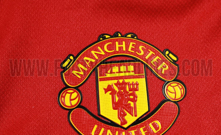
What's peoples thoughts on the crest? I personally like that it is no longer on that false background but the heat print looks a bit cheap. I dig the jersey though.

I like it ,the heat print is only on the adizero player issue kits, the cheaper replicas will have embroidered badges.
 
manchester-united-17-18-home-kit-4.jpg


What's peoples thoughts on the crest? I personally like that it is no longer on that false background but the heat print looks a bit cheap. I dig the jersey though.
Players kits always have heat printed crest. replica kit crest will be the same as last year.
 
2470372604_61be3ab8f4_o.jpg

Even if this is a Liverpool shirt I like the design of it. If we went for something similar, i'd move back the Adidas logo where it should be and might want the lines to be moved down by the side on the bottom of the shirt.
 
That second one is an absolute beauty :eek: and the chevrolet crest wouldn't look so bad. Sometimes I wish we wouldn't always go for similar kits all the time. I understand the need to uphold traditions with white, black and red but it's all a bit boring.

Ugh. It looks like a Liverpool kit.
 
I do really like those socks. The plain black with the white devil on the front. Looking forward to seeing us play in all black.
 
When are those kits due to be out. Except that 3rd one, it's fecking pathetic. Make ya sick.
 
Assuming those black shorts are the bottom half of the jersey that was posted a few pages ago, right?