Manchester United Kits 2014/15

Status
Not open for further replies.
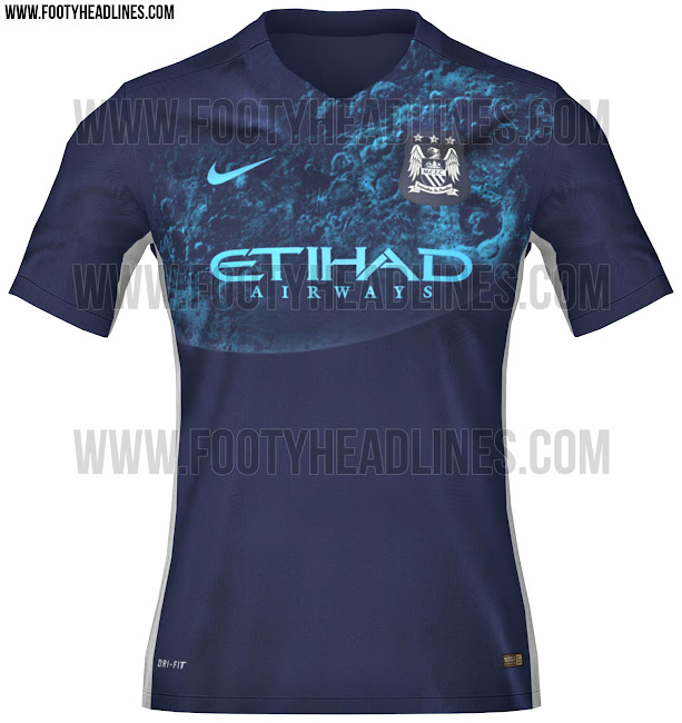
manchester-city-15-16-away-kit.jpg


Unique city kit for next year.

Truth be told it would be best if the kit manufacturer was changed every 4 or 5 years to keep things fresh. I'm glad we have adidas as i'm an 80's fanboi. Some of the kits that Nike made were poor but I think that is down to the pressure to make 3 unique kits every year. Adidas will be a bit of a change but will also suffer the same problem especially towards the end of the deal.

Looks awesome
 
manchester-city-15-16-away-kit.jpg


Unique city kit for next year.

Truth be told it would be best if the kit manufacturer was changed every 4 or 5 years to keep things fresh. I'm glad we have adidas as i'm an 80's fanboi. Some of the kits that Nike made were poor but I think that is down to the pressure to make 3 unique kits every year. Adidas will be a bit of a change but will also suffer the same problem especially towards the end of the deal.
That does look quite nice. Just don't like how the badge is in it's own box.
 
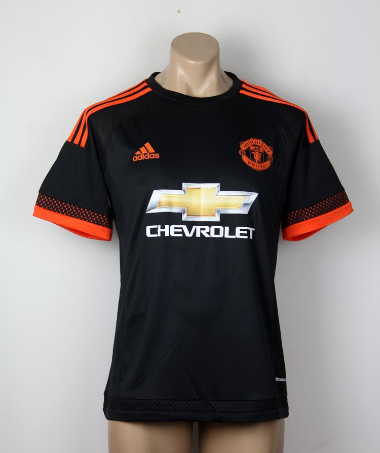
OrangeKit.jpg


The more pictures I see of this "leaked" kit, the more I like it. Definitely looks more orange than red though.

It's quite nice but it does lookvery much like a training kit IMO. Not a fan of the dotted sleeve either but it certainly better than anything nike have served up recently.
 
Would look better with just the dots at the bottom of the sleeve, an embroidered crest, and..red.
But still way more interesting than Nike.
 
It's a very Adidas jersey. Chucking in orange and random dot patterns.
 
Our kit looks :drool:. Will be getting that black one
 
As long as that horrible gold chevrolet logo is on the jersey's I can't see myself buying any. The clash of colours is awful.
 
manchester-city-15-16-away-kit.jpg


Unique city kit for next year.

Truth be told it would be best if the kit manufacturer was changed every 4 or 5 years to keep things fresh. I'm glad we have adidas as i'm an 80's fanboi. Some of the kits that Nike made were poor but I think that is down to the pressure to make 3 unique kits every year. Adidas will be a bit of a change but will also suffer the same problem especially towards the end of the deal.

Is that a blue moon?

My god, that's naff.
 
A deeper red rather than traffic cone orange/remove those stupid dots & trim around the arms and it would be nice. Looks rank as it is.
 
I'm not sure if this is a coincidence or not but all of Adidas' big teams will have white away kits next year (according to leaks)

United - http://www.footyheadlines.com/2015/03/adidas-manchester-united-15-16-kit.html
Bayern - http://www.footyheadlines.com/2014/12/fc-bayern-munchen-15-16-kit.html
Chelsea - http://www.footyheadlines.com/2014/12/chelsea-15-16-kits.html
Milan - http://www.footyheadlines.com/2015/02/ac-milan-15-16-kit.html

Madrid also have an all white home kit and Juve's away hasn't been reveled yet.
 
As long as that horrible gold chevrolet logo is on the jersey's I can't see myself buying any. The clash of colours is awful.
I know! There were some really nice strip designs where they used the single colour Chevrolet logo in the shirt accent colour instead of the gaudy American gold version and they looked fantastic.

I think the full colour logo will always sit uncomfortably on any shirt, especially at the maximum size (which is what they will always go for) as it is too dominant.

Trying to tell an American that something might actually be more memorable subconsciously if it were smaller or if it integrated with it's other component parts more aesthetically is a waste of time.
I can't abide by that. As ghastly as it is the fact 95% of this thread is talking about that very logo tells me theri marketing team would be happy.
 
I can't abide by that. As ghastly as it is the fact 95% of this thread is talking about that very logo tells me theri marketing team would be happy.
Only 95% :eek: of a thread about our new shirt design which must carry that logo … on a Manchester United fan board you mean???? Yeah, that's exactly why Chevrolet shell out £47m per year for the privilege … to make sure 95% of the members of the CAF that contributed to that particular thread all might one day consider purchasing one of their motors!

In all seriousness, most of the talk on here is not exactly pro the gold logo and I can see why. I stand by my comments about loathing US in-your-face marketing and maintain it's unsuitable for us and could be handled much better.

If I've got time tomorrow I'll do some mock-ups that show you the difference and you can decide for yourself.
:lol:

Yeah you're right, I mean Americans fail miserably when it comes to marketing, its why ill be browsing the web on my Amstrad laptop tomorrow shopping for a new Rover whilst tucking into a nice wimpy. Have a quick gander at the most valuable brands in the world, the top 6 are American. I'm not arguing that the logo looks shit on the kit, far from it, just that however crass it may look, its effective.
 
Last edited:
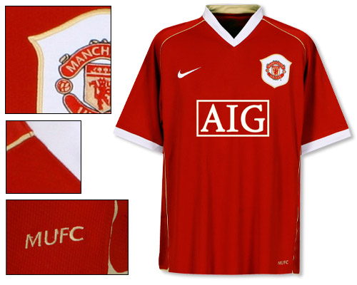
Gold on red reminds me of my favourite football United played and one of my favourite United kits.

16284.jpg
As someone said earlier, the only way the gold Chevrolet logo would look well would be if Adidas made the stripes on the sleeves and the Adidas logo the same colour of gold......We've used gold before like the one from the 2006/2007 season.
 
Aye, those sleeves look like shopping bags. You'd have to be built like a tank if they're as big as they look. They're almost as wide as the waist.

Replica kits always feel like they're built for random shapeless fat people, as wide at the waist and sleeves as the chest, annoying.
 
The ones I get off Aliexpress are shaped perfectly and I'm really skinny. But then again those are made by Asians who are small so their fits are different than the real ones.
 
Status
Not open for further replies.