UnofficialDevil
Anti Scottish and Preoccupied with Donkeys.
Have we still got that bloody horrible logo? I though we were going to be sponsored by someone else next year?
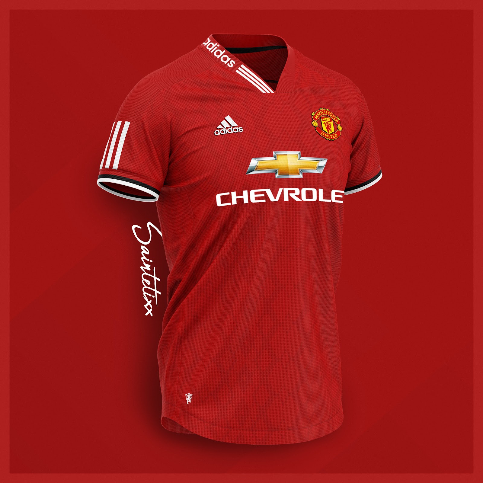
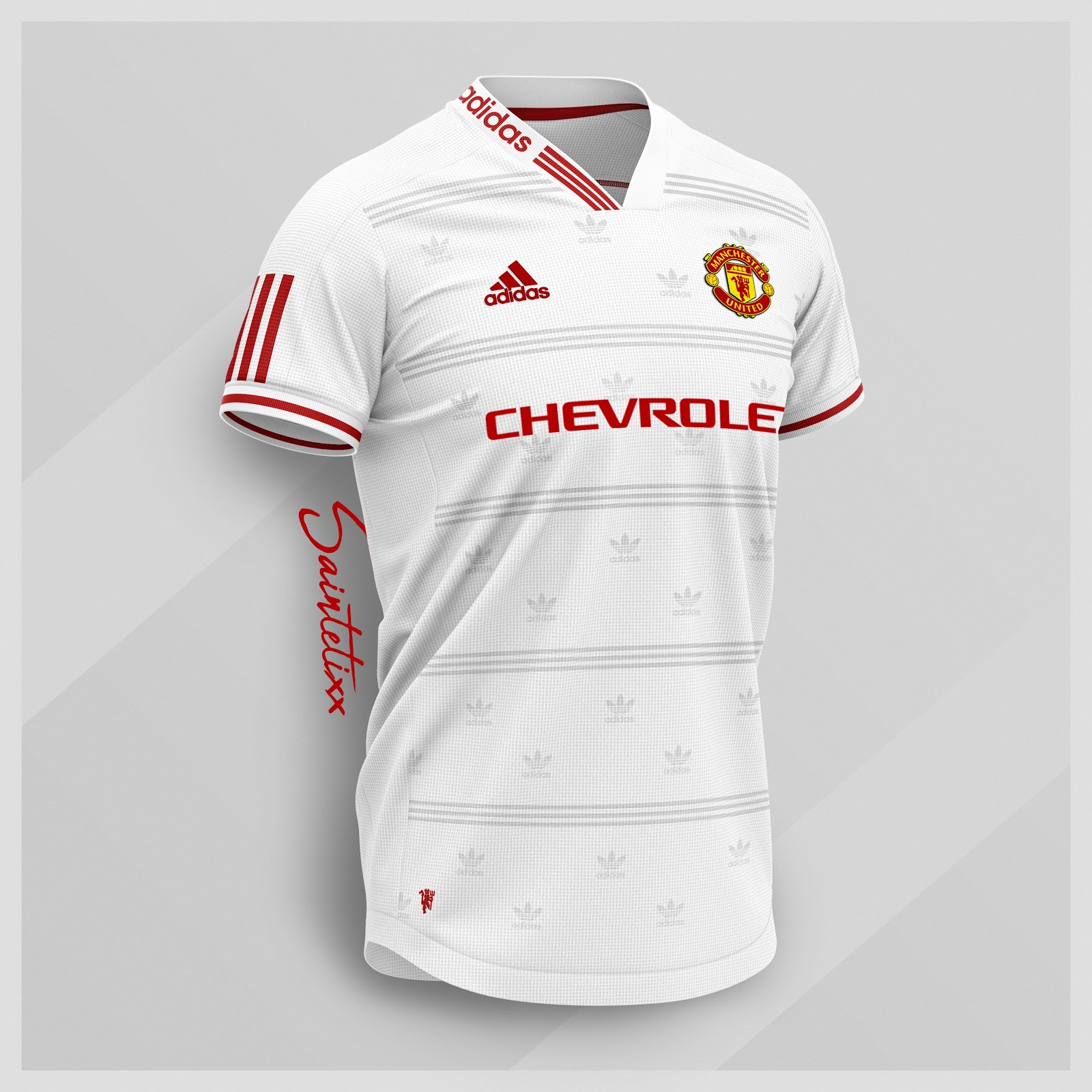
They’re all shit, although the white one has reminded me that we haven’t had a proper nice white kit in years.Absolutely LOVE these concept kits (large pictures!):
Home:

Away (without all the Addidas logos everywhere):

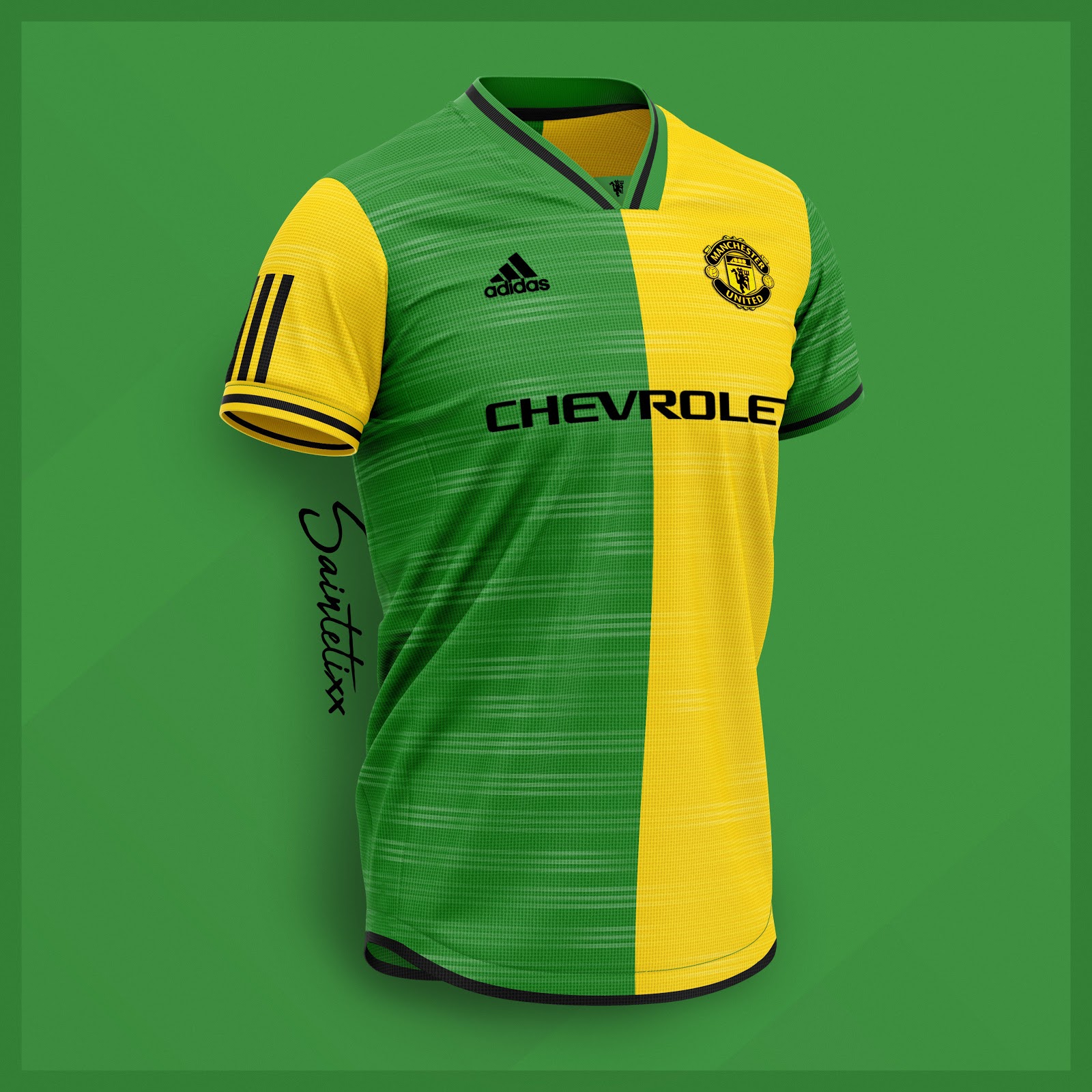
3rd:


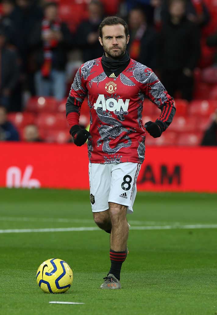
Think that was a special kit done for Chinese New Year. Pretty sure the players wore them in pre match training once this season?Whats this monstrosity?

Why would we make a special kit for Chinese New year?Think that was a special kit done for Chinese New Year. Pretty sure the players wore them in pre match training once this season?
Actually you're right. I guess it doesnt look that bad on the players.Think that was a special kit done for Chinese New Year. Pretty sure the players wore them in pre match training once this season?


That yellow and green one is dire. Black is a mix of the last two black ones we've actually had from Adidas.

Probably some of the nicest concept kits I've seen this year, shame Adidas can't hire designers like this.
One more season and they're gone...Have we still got that bloody horrible logo? I though we were going to be sponsored by someone else next year?


Probably some of the nicest concept kits I've seen this year, shame Adidas can't hire designers like this.
Thank god. Worst looking kit sponsor everOne more season and they're gone...
Thank god. Worst looking kit sponsor ever
It looks like an awful Norwich jerseyYellow one is awful. The design is a bad mixture.
Adidas first Celtic efforts. Clean and nonsense free unlike ours
Adidas first Celtic efforts. Clean and nonsense free unlike ours
From what I'm seeing in the replies it might just be a mock-up.
Funny how random people on the internet can make smarter kits than someone probably getting paid shit loads.
100% fakeAh is it? Id thought id read Celtics kits were being released. Hope these are accurate
Yellow is clearly taken from the club crest. Nobody has ever kicked off about that.Yellow in our kit? That's not our colours. feck about with away kits of your must but don't give us a Liverpool kit.
It's not our kit colours. I don't care if it's in the crest - I can't recall a single Utd home kit with yellow in it in my now rather long life. Red, White, Black. So, I'm kicking off about it.Yellow is clearly taken from the club crest. Nobody has ever kicked off about that.

