- Joined
- Jan 3, 2009
- Messages
- 46,383
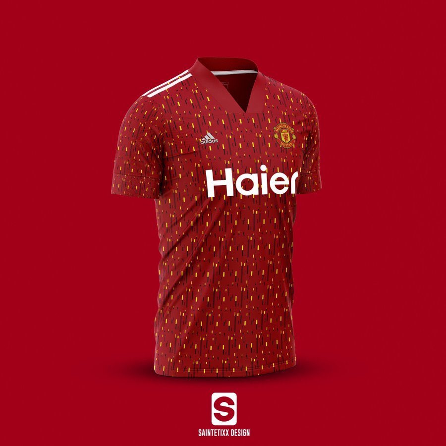
It looks decent in that mock up. You all wear bootcuts anyway. Tom Cato knows feck all.

The only thing that would make that jersey look good is a bonfire.
This is doing the rounds on Twitter atm. Presumably based on the footyheadlines article but it could've been what they based their article on.
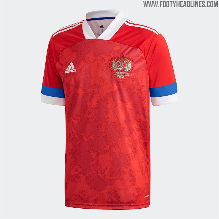
Now looking at the template for Russia/Belgium etc I wonder if the sleeves to bottom of the V-neck will just be red. You can see how the sleeve wraps over better on the Russia shirt but there's that definite split where the main shirt texture doesn't carry on.
Also never heard of Haier but apparently they're rumoured to be our new sponsor. Also the above doesn't have Kohler on the sleeve.
Doesn't look great, certainly doesn't look like a United shirt but we'll see.


If the leaks are anything to go by, then all 3 kits next season are going to be bad
It looks decent in that mock up. You all wear bootcuts anyway. Tom Cato knows feck all.


Someone made a mockup based on the leaked pattern

Hope the final product is easier on the eyes since those look like a public bus seat cover...
Someone made a mockup based on the leaked pattern

Hope the final product is easier on the eyes since those look like a public bus seat cover...
Ha. Kept trying to come up with what it reminded me of. Bus seat cover indeed.Someone made a mockup based on the leaked pattern

Hope the final product is easier on the eyes since those look like a public bus seat cover...
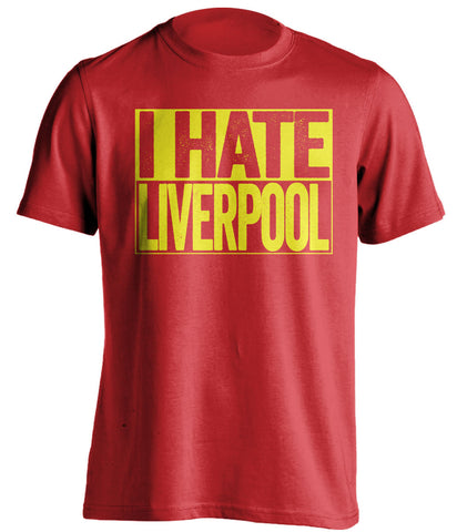
Look at our crest to be fairRed and yellow - looks like Liverpool, aren’t they their colours?
looks utterly horrendous.
I bough a short when I went to the FA Cup final a couple of years back, wouldn’t buy one now in case, definitely wouldn’t go anywhere near something that looks like this.
Look at our crest to be fair
Someone made a mockup based on the leaked pattern

Hope the final product is easier on the eyes since those look like a public bus seat cover...
You re right.indeed. But I can’t remember a home kit that’s red and yellow. They are the colours synonymous with Liverpool.

I love it!
Usually a lot more leaks by this time of the year, strange that this one has managed to keep under wraps
Its supposed to be gold not yellow....Look at our crest to be fair
That’s just on this seasons jersey. Our actual crest is red and yellow. Has been for a long time.Its supposed to be gold not yellow....
I really like the colourscheme for the away tbh. Think it'll look great.
The greenish grey and orange colour? Im not sure about how they could make that look good or even relate it to utd? And the 100's & 1000's or sprinkles design of the 3rd kit is bad
I don't think it'll relate much to United but it's a good colourscheme. The Predators/other Adidas boots in that greenish grey look really good.
