Football Kits 2015/16

Status
Not open for further replies.
B_6bTIIW8AA32XE.png:large

Love this. Classy shirt, my favourite since City switched to Nike.
 
City must have a clause with Nike and previously Umbro on picking the design of their home shirts. Every single one for the past 5-6 years has generally been the same. No Chevron or Gingham monstrosities where classic design goes out the window. That being said, none of them look different except for the collar.
 
Nice jersey. Uniteds jersey last season was the nicest in a long time.
 
That City shirt looks fantastic to be fair, Wonder when the Adidas leaks will start hitting.
 
Those shorts :lol:

New Portugal away, wanna see with a player wearing it but not really a fan

Sp15_NTK_Portugal_PR_A_Full_Body_V2_R_square_600.jpg
 
I like both of those. Nothing wrong with those shorts either.

Do a similar design every year and people complain. Do something different and people laugh.
 
I like both of those. Nothing wrong with those shorts either.

Do a similar design every year and people complain. Do something different and people laugh.

It´s a matter of taste. Those shorts look like beachwear to me.

I liked our white and blue away and we didn´t wear it enough. It was based in previous traditional Portugal aways. I just don´t relate to this kind of design but i´m not really a Nike fan.
 
It´s a matter of taste. Those shorts look like beachwear to me.

I liked our white and blue away and we didn´t wear it enough. It was based in previous traditional Portugal aways. I just don´t relate to this kind of design but i´m not really a Nike fan.
Yeah that's fair enough. It just highlights how we all have different tastes doesn't it.

I'm quite open to having different designs, and if they work then great. If not, move on.
Trying it on Hollands away kit, which we won't see much, is probably a good place to try it anyhow.
 
Dutch shorts wouldn't look out of place at Topman.
 
It's not bad, better than the current - would have preferred a proper collar but overall it's okay. Haven't bought a replica shirt for a few years I prefer the club range of retro shirts. Which generally are very good.

Personally think all clubs should listen to the fans a bit more when designing these new kits.
 
Last edited:
Shirt itself is fine though the logos and text look a little strange since they are in 3 distinct styles. Also did they go with a different shade of red? Looks more like "our" red than the darker one they've had
 
Dutch shorts look like the printer needs a new cartridge.

The dipper kit looks like a printing error too. I don't know why they don't just have a normal collar and forget the stupid patterns. Home kits should be simple.

CCO4kwqUwAAywtA.jpg


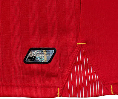
Looks like a plastic badge from that.
 
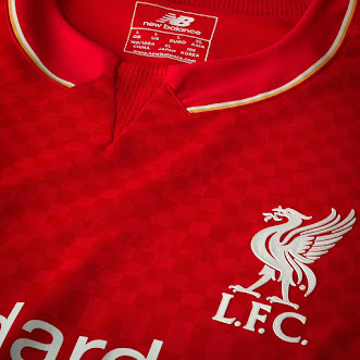
Is that gingham I spot at the top of the shirt? And what is going on with that collar?
 
Yep, tablecloth pattern as suspected. It looks much more worse up close.

New-Balance-15-16-Liverpool-Kit.jpg
Liverpool-15-16-Home-Kit-7.jpg
 
It looks like a load of experimental "blue sky" ideas all thrown together into one shirt.

Maybe they were going for a "so wrong, it's right" vibe
 
Not bad, when did they lose the crest though? Looks too modern and commercial, Adidas better not feck around with our badge...
 
It doesn't look as bad as in that leaked one, But its still not great.
 
Status
Not open for further replies.