Señor
Humongous twit who can't read
- Joined
- Jan 5, 2014
- Messages
- 8,720
The black and red third strip doing the rounds again. Please be this one..
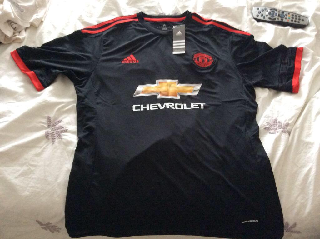
You can tell that's a photoshop because the chevy logo looks fiery orange instead of golden yellow. Sucks, cause it looks a hell of a lot nicer in red.The black and red third strip doing the rounds again. Please be this one..

The black and red third strip doing the rounds again. Please be this one..

just reading the article and the designer says it was indeed based on the 1982 shirt for the vintage vibe, paying attention to getting the right 'red' associated with the past. Also a subtle reference to the 92 away shirt on there somewhere. Cant wait to see it at old Trafford next Saturday, bring it on!
just reading the article and the designer says it was indeed based on the 1982 shirt for the vintage vibe, paying attention to getting the right 'red' associated with the past. Also a subtle reference to the 92 away shirt on there somewhere. Cant wait to see it at old Trafford next Saturday, bring it on!
That's odd. The Adidas website are selling #23 with Schweinsteiger.haha, good one. But...

hmm, very odd.That's odd. The Adidas website are selling #23 with Schweinsteiger.
About time another French speaker got it.Fellaini #7??
It's on that funny flap at the bottom of the shirt, they've gone for the adidas leaf print slightly on the bottom.just reading the article and the designer says it was indeed based on the 1982 shirt for the vintage vibe, paying attention to getting the right 'red' associated with the past. Also a subtle reference to the 92 away shirt on there somewhere. Cant wait to see it at old Trafford next Saturday, bring it on!

Its not 100% yet.. shaw changed after pre season.. can see the schs being shorter numbersSchweiny is 23, Schneidy is 28 when I looked on the Adidas site. Depay sadly won't on the list but the cnut Di Maria is!
I'm not sure these days whose name I would get on the back of our shirt. About 3 seasons ago there were probably about 10 players I felt a strong affinity to
If he just had "Herrera" on his back I'd get that, but it looks shit with his full name there. I'll probably get Mata.So true! I guess our options are:
1. Carrick (understated, long serving, and great player)
2. Depay (Young, exiting, and hopefully here for the long term. No dreams of Madrid yet.)
3. Shaw (same reasons as Depay + English - Madrid is less likely)
4. Hererra (just because I really like him).
Only reason why he is at 4 on my list! Hoping the font on the new kits makes it look better!If he just had "Hererra" on his back I'd get that, but it looks shit with his full name there. I'll probably get Mata.
Yeah true, in that (fecking awful) video it looked like it might fit in a straight line across the top, which would be miles better. It's the curve that makes it look shite I think.Only reason why he is at 4 on my list! Hoping the font on the new kits makes it look better!
It seems to look better with the lettering straight across. The way he had last season made it look like his name was disappearing under his armpits. I bought a full kit for the little lad yesterday. The top is a couple of sizes older (he is 8), it is not overbig on him at all. If I had bought the correct size it might have actually been too small. When I went in the afternoon to D W Sports there were hardly any shirts left.If he just had "Hererra" on his back I'd get that, but it looks shit with his full name there. I'll probably get Mata.
I like the video.Yeah true, in that (fecking awful) video it looked like it might fit in a straight line across the top, which would be miles better. It's the curve that makes it look shite I think.
Haven't seen the new lettering other than the tiny glimpses in that video, so that's good to know!It seems to look better with the lettering straight across. The way he had last season made it look like his name was disappearing under his armpits. I bought a full kit for the little lad yesterday. The top is a couple of sizes older (he is 8), it is not overbig on him at all. If I had bought the correct size it might have actually been too small. When I went in the afternoon to D W Sports there were hardly any shirts left.
Loads of people seem to. I think it's hilariously bad.I like the video.

Good thinking batman !If they were producing this as the 3rd kit, I don't think they would have launched this as a training kit:
I hope to do the same one day, my surname is MessiNever bothered with having any names on the back until we signed Jones, then I did but that's because it's my surname not that he's my favorite player!!

They're the exact same shirts, unless you were looking at the match spec ones!Last year when visiting the MegaStore I noticed the superior quality of the kids kit in comparison to the SportsDirect version my little brother had on at the time.
Even the quality of the prints on the back were better.
I presume this is why they have always been priced higher.
They're the exact same shirts, unless you were looking at the match spec ones!
Also, that Schweini shirt next to Valencia and Herrer's looks fake for some reason... it looks lower down than the other two and more curved than the print on his shirt this year (on the tour).
Yeah but who buys everyday clothes from sports direct? Their sports lines such as boots, kits and equipment are the same as you'd find in any Nike/Adidas/megastore shops.Actually about sports direct. They do apparently buy fakes. I know this because I know some fake dealers. Not necessarily football shirts but brands like Bench and Firetrap. Apparently Bench/ Firetrap don't mind because its publicising their brand or something.