Best and Worst Crests
- Thread starter Say Goodbye
- Start date

You are using an out of date browser. It may not display this or other websites correctly.
You should upgrade or use an alternative browser.
You should upgrade or use an alternative browser.

Van Piorsing
Lost his light sabre
Pirateeeeees !

Jimy_Hills_Chin
Desperately wants to be ITK
Is that ship on the United crest to represent the Manchester Ship canal?
SharkyMcShark
Horrified
Rotherham's makes me sad to be a football fan

It looks like a mummified dick is about to attack
MUFAN79
Full Member
Scrumpet
There are no words
What's with Valencia and the bat thing?
Doevle
Full Member
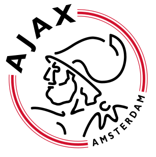
Ajax one is class. Liverpool have a nice crest as well 
Ryan's Beard
Probably doesn't have a career as a comedian
It looks like a mummified dick is about to attack
"attack" is not a word I'd like to see in a sentence along with mummified dick, if I'm honest.
Guangzhou's slogan is king. "Be the best for ever"

What's with Valencia and the bat thing?
There's a bat on the coat of arms of Valencia (the city), probably some random heraldry rather than anything meaningful.
Skorenzy
Full Member
- Joined
- May 2, 2011
- Messages
- 5,947
I like most of the Valencian clubs' crests
Valencia

Villarreal

Levante

Zaragoza have a classy one as well.

Palermo's looks like a 30s movie poster

always liked juve, milan and inter's crests.
Cesena's is different from the usual lions or eagles..

And Catania's with random elephant

Bari then again went completely wrong with their animal themed crest...
what an abomination

Valencia
Villarreal
Levante
Zaragoza have a classy one as well.
Palermo's looks like a 30s movie poster
always liked juve, milan and inter's crests.
Cesena's is different from the usual lions or eagles..
And Catania's with random elephant
Bari then again went completely wrong with their animal themed crest...
what an abominationsampdoria - cool as feck
crests on the continent are much more interesting and better than english ones.
crests on the continent are much more interesting and better than english ones.
- Joined
- Nov 19, 2009
- Messages
- 59,735
What's with Valencia and the bat thing?
It's everywhere there- it's on the Bacardi bottle too I think.
- Joined
- Nov 19, 2009
- Messages
- 59,735
Some more iconic ones:


Oh, and this is pretty cool
That Sampdoria badge looks like a Gorillaz album cover.What's with Valencia and the bat thing?
The heraldic use of the bat in Valencia, Catalonia and the Balearic Islands has its origins in a winged dragon (vibra or vibria) that was crowning the helmet or cimera reial of the Kings of Aragon. Although traditionally the dragon helmet is ascribed to king James I of Aragon (1208 – 1276),[1] reliable documents state that the winged dragon cimera reial didn't appear over the helmet until Peter IV of Aragon's reign (1319 – 1387).
There is also a legend that says that thanks to the humble intervention of a bat, king James I of Aragon was able to win a crucial battle against the Saracens that allowed him to win Valencia for his kingdom. However, original documents state that the animal was a swallow and not a bat.[2]
Wikiaddict.
I_live_cement
Cat freak
If anyone wondered why AC Milan's crest has an England flag on it, this question was asked here 8 years ago. Thanks Redcafe.
https://www.redcafe.net/f7/ac-milan-barcas-english-connection-44457/
It's not an England flag, it's the flag of Milan.
The club does have an English connection though as it was founded by two English men, as a "Football and Cricket club".
That's why it's official name is A.C. Milan, and not A.C. Milano.
- Joined
- Nov 19, 2009
- Messages
- 59,735
However, original documents state that the animal was a swallow and not a bat.
That takes some of the shine off it for me.Collina
Full Member
- Joined
- Sep 26, 2006
- Messages
- 3,414
I like this one.
EDIT: Oh, and this is my favourite United badge:
Shane88
Actually Nostradamus
What's the design on the Sampdoria crest supposed to be? It looks like a scruffy man smoking a pipe.
Waltraute
She-Devil
That's exactly what it is!What's the design on the Sampdoria crest supposed to be? It looks like a scruffy man smoking a pipe.
It's Baciccia, or St John the Baptist in scruffy fisherman form.
77
urinates in helmets
There are some old ones that are shockers/classics


IBleedRed
likes to use pantyhose
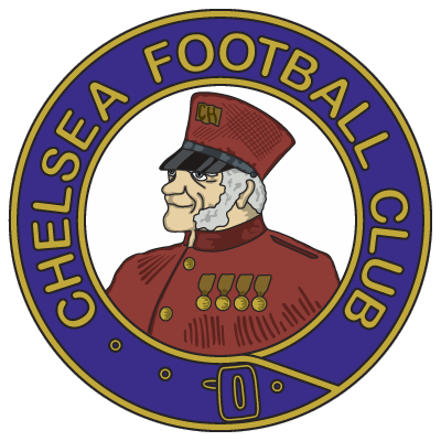
As much as I hate the admit it Chelsea have a classy badge
Though in all fairness it was like that before Roman and the unclassiness that came with him
Though in all fairness it was like that before Roman and the unclassiness that came with him
Eboue
nasty little twerp with crazy bitter-man opinions
I like most of the Spanish and Italian ones. Most of the American ones are bad but I do like the Portland Timbers.

How do we classify if badges are classy or not?
I mean lot of clubs have something that significantly represents something important/close to the club.
Also most new/recent club badges will look shit compared to the old ones.
I mean lot of clubs have something that significantly represents something important/close to the club.
Also most new/recent club badges will look shit compared to the old ones.
As much as I hate the admit it Chelsea have a classy badge
Though in all fairness it was like that before Roman and the unclassiness that came with him
Actually.....
First proper badge

The badge Ken Bates introduced in the 80s...

The badge from 2004...

Erentz
Knows everything! 5 years later.
- Joined
- May 31, 2009
- Messages
- 956
Is that ship on the United crest to represent the Manchester Ship canal?
No, it's to represent trade.
77
urinates in helmets


The old Sunderland badge was good

Classic


Wonder Pigeon
'Shelbourne FC Supporter'

I like this one.

TheHorse'sMouth
Full Member
- Joined
- Oct 10, 2010
- Messages
- 6,188
- Supports
- Arsenal
I hate the modern Arsenal one, it looks as if its been patched up on MS Paint by a bunch of 11 year olds. Give me our iconic 'Victoria Concordia Crescit' crest every day of the week, my old 97-98 shirt gives me daily memories.

77
urinates in helmets
All of the early MLS crests were awful
MarylandMUFan
Full Member
I hate Man City's because of their 3 stars for a "continental feel".
Stobzilla
Adores babies

Brondby, I like this one.
I like this one.
Skorenzy
Full Member
- Joined
- May 2, 2011
- Messages
- 5,947
Random ones...
wtf

These are cool:
Atalanta (1970s)
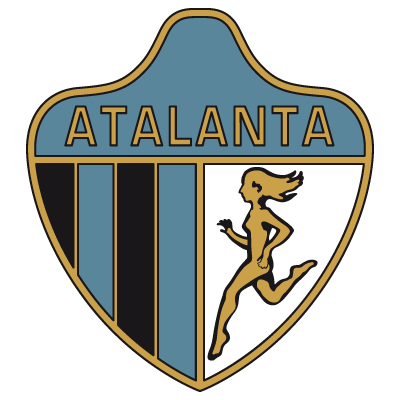
Beira Mar (1990s)

wtf
These are cool:
Atalanta (1970s)
Beira Mar (1990s)
Shane88
Actually Nostradamus
Elche CF's is cool.

My homeland biggest club, probably due to it's origins, had a similar crest to Benfica. When we were unexpectedly promoted to the Primeira Liga, some games looked like this:
 -
-

Notice the birds are different. Benfica's symbol is an eagle, whilst Santa Clara's is either a "Milhafre" or an "Açor".
First settlers saw "Milhafres" and thought they were "Açores", hence the name of our islands - Azores.
In 2011 the crest changed to this. The nine stars represent the nine islands, not Champions League titles, if you're wondering:
Code:
[quote="cj_sparky, post: 12632532"]The German's have some awful Badges.

Wolfsburg

[img]https://www.scpaderborn07.de/medien/1245/300/2/logo_wolfsburg.gif[/img]

Hannover

[img]https://icons.iconarchive.com/icons/giannis-zographos/german-football-club/256/Hannover-96-icon.png[/img]

Hamburg

[img]https://www.logolook.de/wp-content/uploads/HSV_Logo.png[/img][/QUOTE]
The German ones remind of my gas stations signs or symbols on highway rest stops.
ghaliboy
Snitches on Tom Hagen
Looking at the title of this thread on the main page I thought.. What a ridiculous thread.. How much of this boring shite could you discuss.
Then some of these logo's are terrible.. LOL gave me a good laugh.

Lol
I like my home town clubs logo.
ONGC FClysglimt
Full Member
- Joined
- Jun 1, 2008
- Messages
- 16,952
Maybe it's just me but I always liked Southampton and WBA
I hate the modern Arsenal one, it looks as if its been patched up on MS Paint by a bunch of 11 year olds. Give me our iconic 'Victoria Concordia Crescit' crest every day of the week, my old 97-98 shirt gives me daily memories.
This is top notch to be fair
Actually.....The badge Ken Bates introduced in the 80s...
The badge from 2004...
Yeah that was a confusing statement
Share: