Has Niall ever considered forum tabs?

WeasteDevil

New Member
Joined
Jun 21, 2001
Messages
109,013
Location
Salford in Castellón de la Plana
Displayed at the top of thread and forum pages - the main idea not only providing greater usability, but also as a bandwidth saving measure. Nothing else would require changing.

For example, if I'm in a post in the general, or in the general itself, and then decide to go to the United forum, there are four options. The first is to scroll right to the bottom of the page for the forum jump, the second use the nasty quick links menu (which only has four in any case), the third start clicking the back button on the browser, or fourthly do what I do, click the forum button and then the forum I want to go to, thus causing page refreshes. It would be interesting to know what the majority of people do in this situation.

Would a solution similar to that shown below be far more elegant and simple?
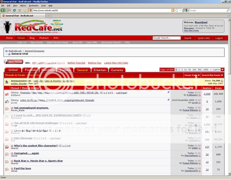
caftabs.jpg


Just a thought.
 
I'm on a few other forums which have quick links to other sections of the forum and forum tabs..
but I still go to the index page, just to see which forum has the newest post rather than going to every different section of the forum to see if there is a new post?
 
It might be a good solution. I don't know if it is a standard option with vBulletin or if there is a mod/hack available. I'm guessing that it can be done one way or another.
 
I'm on a few other forums which have quick links to other sections of the forum and forum tabs..
but I still go to the index page, just to see which forum has the newest post rather than going to every different section of the forum to see if there is a new post?

An interesting thing that you could do with tabs from the user interface point of view is that say you hovered over the tab for a second, a drop down menu could appear showing the first 150 characters of say the last ten posts in that forum - a bit like you sometimes see twitter sidebar feeds on certain websites. I think that this could also gives the mods a valuable tool to view what is going on at any one time at a glance.
 
Looks good - don't see why anyone would vote against it...
 
Most forums are available in the quick list in the top right of the page. It would make more sense to add the rest to that list, rather than add tabs which are image based and would take up more bandwidth than is currently being used.
 
Most forums are available in the quick list in the top right of the page. It would make more sense to add the rest to that list, rather than add tabs which are image based and would take up more bandwidth than is currently being used.

You assume too much, and wrongly. In any case, the drop down menu from a UI perspective is poor.
 
You assume that each tab is an image, it doesn't need to be.

I used your mock up screenshot as a guide Weaste. I'd say those were image tabs. It's not my fault you weren't clearer.

The point stands anyway. It would be much easier to just add the remaining forums to the quick links menu.
 
I used your mock up screenshot as a guide Weaste. I'd say those were image tabs. It's not my fault you weren't clearer.

I said "a solution similar", I don't know how you can not see that as being clear. It doesn't have to use images, and even if it did, the bandwidth cost would be totally minimal if done in the right way.

The point stands anyway. It would be much easier to just add the remaining forums to the quick links menu.

The menu is not a good user interface solution, it's cumbersome and people don't seem to use it. It's also not very expandable to offer other UI components as I have indicated towards.

I suppose that you are a web programmer?
 
I said "a solution similar", I don't know how you can not see that as being clear. It doesn't have to use images, and even if it did, the bandwidth cost would be totally minimal if done in the right way.


The menu is not a good user interface solution, it's cumbersome and people don't seem to use it. It's also not very expandable to offer other UI components as I have indicated towards.

I suppose that you are a web programmer?

No Weaste, I'm debating the issue with you despite having no experience of any computing language whatsoever.

I'd personally add the links on the top nav where the 'Home - Forum - Blog - Podcast - Wiki' links are. There's plenty of space for them.
 
I'd personally add the links on the top nav where the 'Home - Forum - Blog - Podcast - Wiki' links are. There's plenty of space for them.

Ok, but that's taking them out of context in terms of the interface. You should think of that as the contents page of a book. In the case when you are in the forum, the forum context tools in the grey User CP->New Posts->Mark Forums Read, etc. are simply tools, not content navigation.

Tabs give you a simple single click navigation option for content, no messing, and offer the possibility of doing more clever things, because they could themselves become drop down menus to offer more diverse navigation of the content.

I thought I was quite clear Weaste. ;)

To clarify, I meant put the links in the red bit, not the grey bit.
 
1) They don't look like tabs, just buttons attached to the top of the forum header. The gradient ideally needs to "flow" into the tab.

2) "I don't like your tab choice" - Do we get a preset set of tabs? Or do we get to customise them?

3) The implication of the tab position implies the navigation isn't forum-wide but (in that case) General Chat-wide. The tabs need to be in the crumb trail box:

Go Back RedCafe.net > Miscellaneous > Admin/Mod Help Forum
Has Niall ever considered forum tabs?
(That box)

If you like, clicking a tab is only expected to largely change the content "within" the tab. However, this defeats the purpose of the crumb trail as this is the de facto navigation control which also changes. Meaning there are two navigation constructs doing different things which is inconsistent design.

As what you want is simply a shortcut, the tabs are essentially no different to buttons.

----

I would prefer Forum Jump to be in the crumb trail itself personally. I believe the vBulletin Administrator Control Panel is able to choose which forums appear in Forum Jump. This is of course really ugly and distracts users.

As an aside, Weaste, what's so bad about option 1?

The first is to scroll right to the bottom of the page for the forum jump,
Considering you usually finish reading the page at the bottom, surely scrolling up for your tabs is even worse?

Forum Jump is meant to be the bottom navigation and it simply feels like you don't like it. That's fair - it's not great, Forum Jump, and its functionality could be expanded.

Still unsure if tabs (or essentially buttons) are the solution personally.
 
1) They don't look like tabs, just buttons attached to the top of the forum header. The gradient ideally needs to "flow" into the tab.

It's a concept, not a visual representation.

2) "I don't like your tab choice" - Do we get a preset set of tabs? Or do we get to customise them?

Again, what are you talking about? They could shuffle around in regards to the most busy forum in the past half an hour or whatever.

3) The implication of the tab position implies the navigation isn't forum-wide but (in that case) General Chat-wide. The tabs need to be in the crumb trail box:

It's interesting that you bring up the crumb box. On a forum such as RedCafe, it's actually rather pointless, as you can never go deep enough for it to be a useful addition, and even then, it's not something that tels the browser to back up, they are just reload links. If anything they simply show you where you are, and provide a nice easy way of skipping back twice in the context of sub forums or when in multi-page threads. They have their uses, but in this case, IMO, they are in the wrong place in terms of UI anyway. They should be in the top red bar. For example where is says "Threads in Forum: General Chat", it would be better "RedCafe.net > General Discussion > General Chat > Threads in Forum"

However, this defeats the purpose of the crumb trail as this is the de facto navigation control which also changes.

De facto? :lol: The rest of that I've already dealt with.
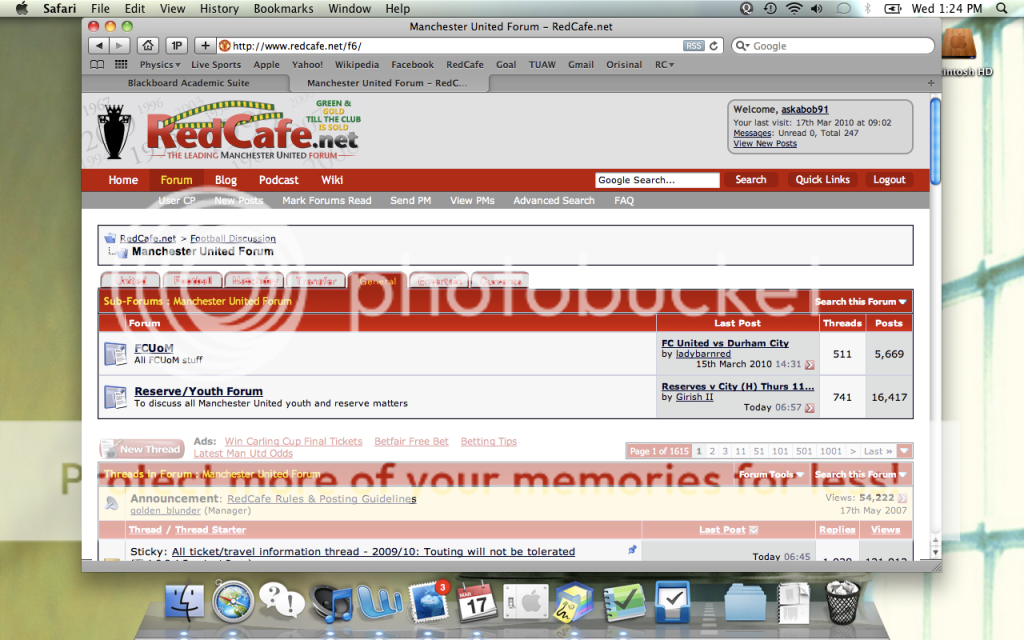
As what you want is simply a shortcut, the tabs are essentially no different to buttons.

All tabs are "buttons"

I would prefer Forum Jump to be in the crumb trail itself personally. I believe the vBulletin Administrator Control Panel is able to choose which forums appear in Forum Jump. This is of course really ugly and distracts users.

As an aside, Weaste, what's so bad about option 1?

It's cumbersome.

Considering you usually finish reading the page at the bottom, surely scrolling up for your tabs is even worse?

Keep it there, but as I've said, drop down lists are not the best ways to navigate content. The fact of where it is doesn't bother me, I could press HOME or END to go to the top or bottom in any case. That in itself is a pain in the hole in terms of UI, but then to have to deal with a drop down menu?

You presume that people change forums always at the bottom of a thread or forum page. I'd suggest that this is not the case, but there is no reason why the tabs could not appear at the bottom either.

Forum Jump is meant to be the bottom navigation and it simply feels like you don't like it. That's fair - it's not great, Forum Jump, and its functionality could be expanded.

I don't like it, it's poor UI when the possibility is there to have the most accessed content a single click away.

Still unsure if tabs (or essentially buttons) are the solution personally.

Have you ever studied HCI?
 
Again, what are you talking about? They could shuffle around in regards to the most busy forum in the past half an hour or whatever.

We have more than 6 forums (or however many tabs you have on there) and the choice of 6 tabs is not always what everyone wants.

I prefer predictability and a tab structure (which to me is a major navigation tool) which changes is not predictable and I would be against that. Unless of course they're just links to the most popular forums in the last hour - in which case I'd still oppose it as a navigation tool but perhaps as an interesting tidbit.

It's interesting that you bring up the crumb box. On a forum such as RedCafe, it's actually rather pointless, as you can never go deep enough for it to be a useful addition, and even then, it's not something that tels the browser to back up, they are just reload links. If anything they simply show you where you are, and provide a nice easy way of skipping back twice in the context of sub forums. They have their uses, but in this case, IMO, they are in the wrong place in terms of UI anyway. They should be in the top red bar. For example where is says "Threads in Forum: General Chat", it would be better "RedCafe.net > General Discussion > General Chat > Threads in Forum"

The crumb trail is in the right place but in general not useful enough because on this forum, and I'd imagine most forums actually, we prefer dealing with things on the same "level", i.e. General Chat and Current Events are on the same level. Hierarchies are useful for presenting the forum but generally not navigation.

vBulletin 4.0 shrinks the crumb trail by default but doesn't provide something like where the arrows produce a list of forums or categories on the same level.

De facto? :lol: The rest of that I've already dealt with.

What I mean is that putting tabs in produces two different navigation constructs which look different and do entirely different things.

It's cumbersome.

Keep it there, but as I've said, drop down lists are not the best ways to navigate content. The fact of where it is doesn't bother me, I could press HOME or END to go to the top or bottom in any case. That in itself is a pain in the hole in terms of UI, but then to have to deal with a drop down menu?

You presume that people change forums always at the bottom of a thread or forum page. I'd suggest that this is not the case.

But when you finish reading a thread, you are right at the end anyway. It's not terribly cumbersome but simply that the Forum Jump is badly-designed.

No I agree that it's not always the case where the user is at the bottom when they change forum. I personally don't (I never use Forum Jump on this forum) - but then again, I only keep hitting "New Posts", killing the server more than you do.

I don't like it, it's poor UI when the possibility is there to have the most accessed content a single click away.

One click but two keystrokes (Home/scroll up, click button). Quite a substantial scroll for most users who don't use the Home key (i.e. non-techies).

Have you ever studied HCI?
I think the problem here is that I don't think the tabs are in the right place. They're no different to the Hotmail, Messenger and Get IE8 links on Hotmail, News, Sport, Music, Movies, Money, Cars, Shopping, Windows Live from MSN UK but they're higher-up the page.
 
Most forums are available in the quick list in the top right of the page. It would make more sense to add the rest to that list, rather than add tabs which are image based and would take up more bandwidth than is currently being used.

Those tabs can be made with CSS 3, I think because it allows for rounded corners. There is no need for images

1) They don't look like tabs, just buttons attached to the top of the forum header. The gradient ideally needs to "flow" into the tab.

Something like this, I presume?
tabs.png
 
Good idea. If I want to move forums, I click the RedCafe banner (I like clicking big things) or the linked navigation tree thing, then go from there.