Football Kits 2018/19

Damien

Self-Aware RedCafe Database (and Admin)
Staff
Joined
Mar 4, 2010
Messages
98,340
Location
Also won Best Gif/Photoshop 2021


Roma's has a chainmail effect.

WGHBGbb.jpg
 
Palace would be awesome were it not for the giant sponsor logo. Roma's done well, after a couple years of pretty boring template shirts from Nike.
 
Chelsea win the best looking sponsor award.

Roma's is smart. Helps that they have classy colours and badge (and sponsor).
 
That's smart to be fair. You lot have had some awful shirts so it's about time :lol:
Looks better with that old school numbering but I'm guessing that's not allowed?
Our home ones are usually nice but the away ones can be truly horrific. Some of the ones Warrior came out with were hilarious.

I think it depends on the competition we’re playing in. Aren’t there different types?
 
Looks better with that old school numbering but I'm guessing that's not allowed?

I believe they can use that numbering in all the other competitions but the EPL. Every team has their own numbering type face they use outside the premier league.
 
Our home ones are usually nice but the away ones can be truly horrific. Some of the ones Warrior came out with were hilarious.

I think it depends on the competition we’re playing in. Aren’t there different types?

Maybe yeah, not sure. Just looked at the close up and the material looks nice as well. Better than the typical plasticcy sportswear stuff.
 
I believe they can use that numbering in all the other competitions but the EPL. Every team has their own numbering type face they use outside the premier league.

Ah ok, ta.

Our home ones are usually nice but the away ones can be truly horrific. Some of the ones Warrior came out with were hilarious.

I liked the tribal one best!
 
Chelsea shirt is so bad. Actually starting to feel glad we cut ties with Nike with this rate.
 
Chelsea shirt is so bad. Actually starting to feel glad we cut ties with Nike with this rate.
All the Nike jerseys for the WC and next year looks horrid. The weird zig zagging scribbles on the arms of every jersey is rotten.
 
Bayern and Roma have nice shirts every season.

Is it just me or do Roma’s kits get more red reach season? Portugal too, what does the world have against burgundy?
 
All the kits in the thread besides the chelsea home looking good, theirs looks like a bus seat. Shame our home kit isn't fantastic either.
 
I don't know how to post pics on here but the new Everton home looks lovely :drool: I wonder if we'll ever go back to Umbro.
 
Here’s your entertainment for the day, courtesy of New Balance.
 
Here’s your entertainment for the day, courtesy of New Balance.

That’d be better with the dark purple shorts n socks instead of that garish purple that dominates the shirt. All in all absolute pish
 
Very American, that. Like an NBA kit.
 
Goodness me! They just seem to go with harsh strange colors every year and every year it gets worse.
 
First Puma kits for Marseille, looking pretty nice.
puma-olympique-marseille-18-19-kits-2.jpg
puma-olympique-marseille-18-19-kits-17.jpg
puma-olympique-marseille-18-19-kits-10.jpg
 
First Puma kits for Marseille, looking pretty nice.

I like all three of those, bit strange the Orange logo is only Orange on the white kit though?

Would look decent on the black too. I used to love the Valencia Black kits with the orange trim.
 
I hate the heather look and raglan sleeves that puma love this year
 
If there's a worse kit manufacturer than New Balance, I have yet to see them!
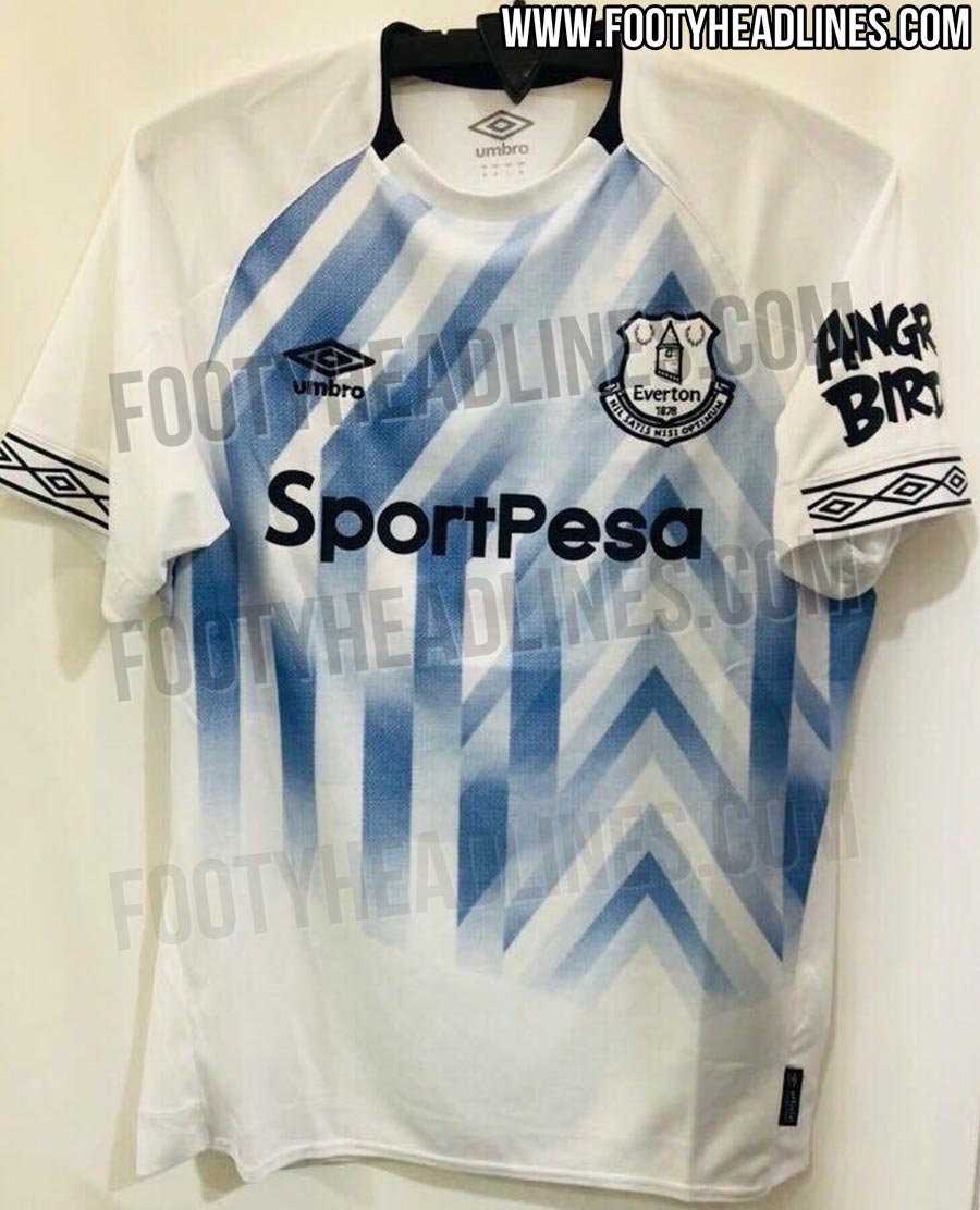
 
Everton’s away kit next season is one of the best yet most original I’ve seen in ages. Retro yet modern.

outstanding-everton-18-19-away-third-kits%2B%25282%2529.jpg


Liverpool’s third on the other hand is fecking awful, again
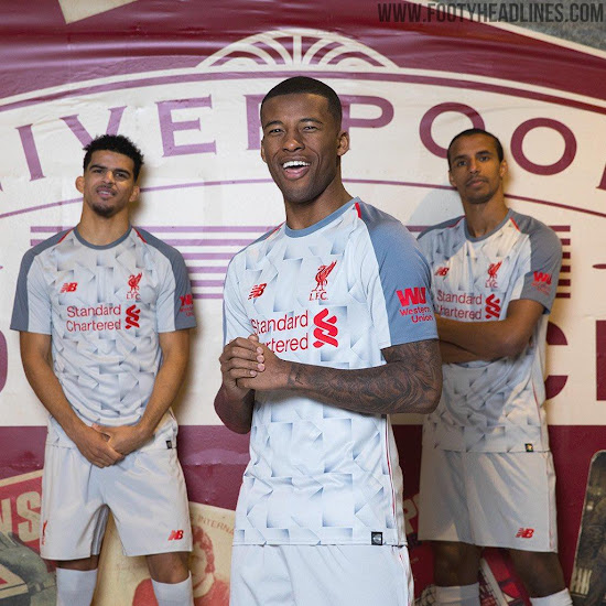
liverpool-18-19-third-kit-1.jpg


The poor bastards must’ve had some of the worst away/third kits in history.
 
Everton’s away kit next season is one of the best yet most original I’ve seen in ages. Retro yet modern.

outstanding-everton-18-19-away-third-kits%2B%25282%2529.jpg


Liverpool’s third on the other hand is fecking awful, again

liverpool-18-19-third-kit-1.jpg


The poor bastards must’ve had some of the worst away/third kits in history.
Is Everton's confirmed? That's a real winner! Wow
 
Everton’s away kit next season is one of the best yet most original I’ve seen in ages. Retro yet modern.

outstanding-everton-18-19-away-third-kits%2B%25282%2529.jpg


Liverpool’s third on the other hand is fecking awful, again

liverpool-18-19-third-kit-1.jpg


The poor bastards must’ve had some of the worst away/third kits in history.
I love that Everton kit.
 
Instead of a big announcement or video, Watford released their new away kit today by quietly sending one in the post to every fan who attended all 19 away games last year. That's fairly class to be fair.

 
City's third kit inspired by Quality Street. WTF is that orange seatbelt doing there? :lol::lol:


Suddenly our pink kit doesn't seem too bad. :wenger::D