Maroon Lucifer
Full Member
10. Metallica

As if Metallica weren’t intimidating enough already, what with their stern lectures about illegal music downloading and all, here comes their wrath-and-indignation logo. With it, the band took the AC/DC lightning-bolt motif to the next level, intensifying the eeeeeeevil via three-dimensional lettering and a few stray shards. Ten bucks says there’s a humorless grad student out there somewhere working on a thesis about the semantics of lightning bolts within rock & roll visual tropes, or something.
-O-
9. Dead Kennedys

A faux-classical font, plus a linear design that combines elements of the Japanese flag (the color scheme) and the New York Yankees logo (the intersecting letters)? Whoa! We’re probably reading way, way too much into this.
-O-
8. The Doors

Ooh, fun with stencils! It’s kinda ironic how Jimbo M. and co. fancied themselves members of the artsy-fartsy underground, and yet their logo remains easily replicable by anybody with a ruler. Deep inside the soul of every boozy rocker lurks an art school dropout, it seems.
-O-
7. Aerosmith

Say what you want about the band itself — that Steven Tyler oughta cut back on the embalming fluid, or that Joe Perry’s appearance backing Sanjaya killed the band’s credibility more than 1,000 Diane Warren ballads ever could — but that logo, which pairs a wings-and-scratchy-font combo with the structural sturdiness of an imitation pilot’s pin, rocks as reliably and relentlessly as “Mama Kin.”
-O-
6. Nine Inch Nails

The world, as Trent Reznor reminds us with his every ominous synth squeal and funereal sentiment, is a totally messed-up place, dude. What better way to remind listeners of this than with a logo so sterile, so minimalist as to darken the day of even the most smiley and apple-cheeked fan? Hope is overrated. Death is near.
-O-
5. Van Halen

As sleek, lean and double awesome as the band’s first 5.5 records (we’re only giving half credit for Diver Down). Also, of all the logos on this list, it is by far the easiest to draw.
-O-
4. Grateful Dead

The Dead’s famous “Steal Your Face” logo, designed by longtime band consort Bob Thomas, led us to believe that the band members themselves were practicing metal heads and/or Satanists. Imagine our surprise, then, when Emily Deutsch played us “Sugar Magnolia” in seventh grade and clued us into the band’s messages of peace, love and better living through pharmaceutical enhancement. The Dead’s design minions deserve some props for their happy-dancing-bears artwork as well.
-O-
3. AC/DC

The pointy-ended goth letters say “we will jolt you.” The lightning bolt that connects them says “perhaps literally, should a low-pressure system happen to collide with the cool air mass creeping up from the southeast.” Cue the For Those About to Rock cannons, will you?
-O-
2. Yes

To be frank, we have no more idea what esteemed English artist Roger Dean was doing hanging around with the self-unaware prog-heads of Yes than you do. For their lively tales from topographic oceans, perhaps? Regardless, Dean’s wonderfully simple “bubble” logo found its way onto numerous album covers, T-shirts and concert bills, exposing his work to many a fan of sissy-voiced singers. Dean is also responsible for Asia’s much-much-much-better-than-the-band-itself logo and first album cover.
-O-
1. Rolling Stones

As bawdy and colorful as the Stones themselves were until the onset of menopause. True-ish fact: While Andy Warhol generally gets credit for designing the logo — he put together the Sticky Fingers zipper-iffic album package that marked its first appearance — the tongue itself was said to have been pinched from an image of the Hindu goddess Kali.
Link: http://www.blender.com/10BestOldSchoolRockBandLogosEver/articles/9/24150.aspx
-------------------O-------------------------------
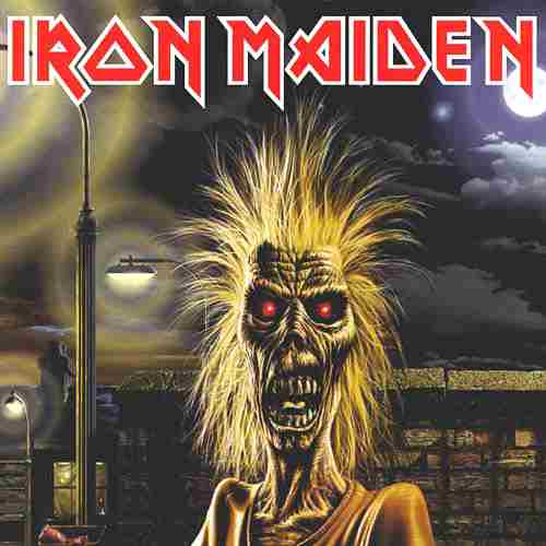
I can not begin to describe my disappointment of this list. No Kiss, Guns N' Roses, Def Leppard, Iron Maiden, Twisted Sister... who all had cooler logos than these imo

As if Metallica weren’t intimidating enough already, what with their stern lectures about illegal music downloading and all, here comes their wrath-and-indignation logo. With it, the band took the AC/DC lightning-bolt motif to the next level, intensifying the eeeeeeevil via three-dimensional lettering and a few stray shards. Ten bucks says there’s a humorless grad student out there somewhere working on a thesis about the semantics of lightning bolts within rock & roll visual tropes, or something.
-O-
9. Dead Kennedys

A faux-classical font, plus a linear design that combines elements of the Japanese flag (the color scheme) and the New York Yankees logo (the intersecting letters)? Whoa! We’re probably reading way, way too much into this.
-O-
8. The Doors

Ooh, fun with stencils! It’s kinda ironic how Jimbo M. and co. fancied themselves members of the artsy-fartsy underground, and yet their logo remains easily replicable by anybody with a ruler. Deep inside the soul of every boozy rocker lurks an art school dropout, it seems.
-O-
7. Aerosmith

Say what you want about the band itself — that Steven Tyler oughta cut back on the embalming fluid, or that Joe Perry’s appearance backing Sanjaya killed the band’s credibility more than 1,000 Diane Warren ballads ever could — but that logo, which pairs a wings-and-scratchy-font combo with the structural sturdiness of an imitation pilot’s pin, rocks as reliably and relentlessly as “Mama Kin.”
-O-
6. Nine Inch Nails

The world, as Trent Reznor reminds us with his every ominous synth squeal and funereal sentiment, is a totally messed-up place, dude. What better way to remind listeners of this than with a logo so sterile, so minimalist as to darken the day of even the most smiley and apple-cheeked fan? Hope is overrated. Death is near.
-O-
5. Van Halen

As sleek, lean and double awesome as the band’s first 5.5 records (we’re only giving half credit for Diver Down). Also, of all the logos on this list, it is by far the easiest to draw.
-O-
4. Grateful Dead

The Dead’s famous “Steal Your Face” logo, designed by longtime band consort Bob Thomas, led us to believe that the band members themselves were practicing metal heads and/or Satanists. Imagine our surprise, then, when Emily Deutsch played us “Sugar Magnolia” in seventh grade and clued us into the band’s messages of peace, love and better living through pharmaceutical enhancement. The Dead’s design minions deserve some props for their happy-dancing-bears artwork as well.
-O-
3. AC/DC

The pointy-ended goth letters say “we will jolt you.” The lightning bolt that connects them says “perhaps literally, should a low-pressure system happen to collide with the cool air mass creeping up from the southeast.” Cue the For Those About to Rock cannons, will you?
-O-
2. Yes

To be frank, we have no more idea what esteemed English artist Roger Dean was doing hanging around with the self-unaware prog-heads of Yes than you do. For their lively tales from topographic oceans, perhaps? Regardless, Dean’s wonderfully simple “bubble” logo found its way onto numerous album covers, T-shirts and concert bills, exposing his work to many a fan of sissy-voiced singers. Dean is also responsible for Asia’s much-much-much-better-than-the-band-itself logo and first album cover.
-O-
1. Rolling Stones

As bawdy and colorful as the Stones themselves were until the onset of menopause. True-ish fact: While Andy Warhol generally gets credit for designing the logo — he put together the Sticky Fingers zipper-iffic album package that marked its first appearance — the tongue itself was said to have been pinched from an image of the Hindu goddess Kali.
Link: http://www.blender.com/10BestOldSchoolRockBandLogosEver/articles/9/24150.aspx
-------------------O-------------------------------
I can not begin to describe my disappointment of this list. No Kiss, Guns N' Roses, Def Leppard, Iron Maiden, Twisted Sister... who all had cooler logos than these imo


